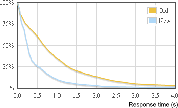
How can I get this graph:

(from Speeding up StackExchange)
It shows what percentage of web requests took longer than N seconds. I have IIS logs and LogParser installed but not sure how to proceed.
How can I get this graph:

(from Speeding up StackExchange)
It shows what percentage of web requests took longer than N seconds. I have IIS logs and LogParser installed but not sure how to proceed.
This is how you can do it with LogParser and Excel:
Step 1 Create the following query and save it as "Time taken graph.sql":
Step 2 Run the query and export results to CSV file:
Step 3 Open CSV file in Excel. I will use Excel 2010 as example.
Let's say your data sits in A1:B401 range:
Put "Time" in D1 cell. Put "Percent" in E1 cell. Fill time in D column with series starting from 0 to 5 with step 0.1:
Step 4 Put the following formula into E2 cell (you will need to replace 401 with your value):
Copy the formula to all cells in E column that have corresponding time value. Set style to Percent by pressing Ctrl+Shift+%
Step 5 Finally, build line graph based on the data in D and C columns:
I wrote a python program to generate that graph using the logs generated by our load balancer and flot to draw the actual graph.
I went through a couple of iterations before I decided on that graph:
I started with a scatter plot (response time versus time of day) which is informative in it's own right, good for getting a good feel for the shape and variance of your traffic even if it's not particularly good for communication.
Then I tried a histogram, which wasn't particularly useful because of the high variance.
Finally I ended up with this which is based on a histogram, but is cumulative and inverted.
I'd post the code but it is so specific to what I was doing that it isn't going to help anybody. So here's an approximation of the core function:
You then plot the
(x, y)coordinates as cutoff ranges over[0,1[using your favourite plotting library.